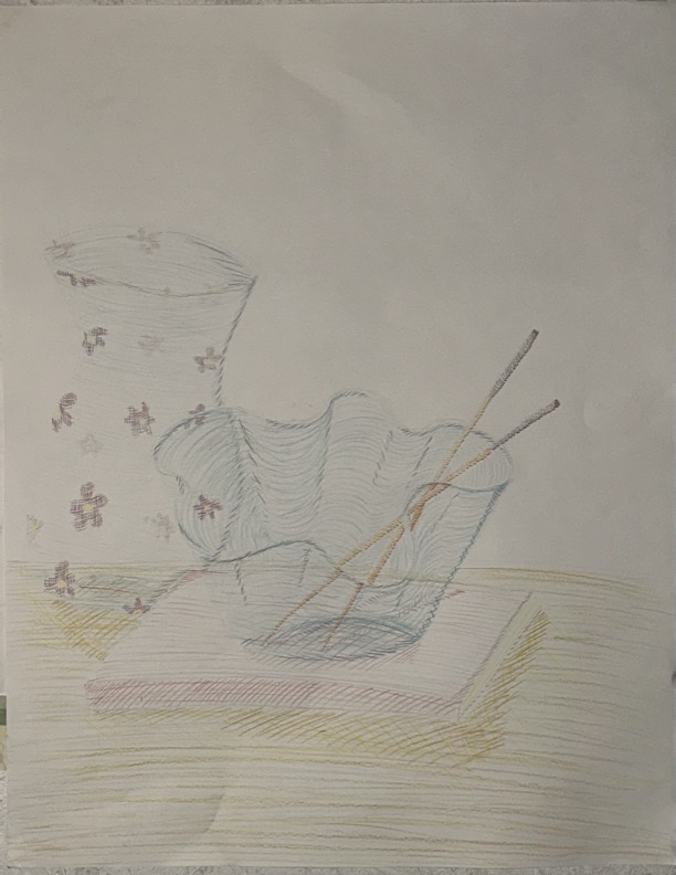
Image Attribution: “Still life, Broken Colour” by Emily Berg is licensed under a different open license (). (See interactive map)

Image Attribution: “Still life, Broken Colour” by Emily Berg is licensed under a different open license (). (See interactive map)
Jayamuni Silva
The overall composition of the artwork is effective, as it guides the view ‘s eyes across the entire artwork. There were a lot of considerations taken when cross hatching most of the objects then as the cross-hatching matches/contours the objects shape giving a three-dimensional effect. Also, the reflection interacts of the pencil with the glass adds a sense of realism to the artwork. The overlapping of objects creates a sense of depth, and I appreciate that the objects are grounded, rather than floating which could have broken the flow of the art piece.
Suggestions: I feel like there could have been more variations of colors used for this as most of the colors for the objects is the same color, more colours could have been used to bring out the broken colour aesthetic. I would have liked it if the colours/ cross hatching were a slight bit darker in some areas, as this would create stronger contrasts, making the three-dimensional forms more pronounced and adding depth to the composition. Introducing more contrasts between hues could make certain objects stand out and enhance the overall visual impact,