Image Attribution: “Assignment 1: Transformation” by Ricardo Alexander Munoz Cazares is licensed under CC BY-NC. (See interactive map)
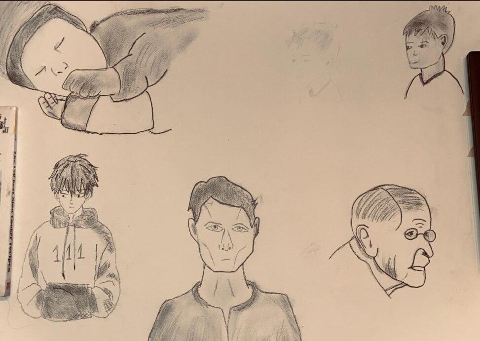
Image Attribution: “Assignment 1: Transformation” by Ricardo Alexander Munoz Cazares is licensed under CC BY-NC. (See interactive map)
Jolie Won-Hyang Cho
1. The layout more effectively facilitates the audience’s understanding of the transformation process following the artist’s implementation of the instructor’s suggestion, which involved relocating the boy’s portrait to the upper right corner. However, to better align with the assignment requirements, the transformation should incorporate an element of unpredictability, rather than demonstrating an expected outcome of the process.
2. I would appreciate consistency in the drawing style within a single assignment, such as using either a realistic technique or a comic style, to better facilitate the depiction of the transformation process. Additionally, the use of vivid outlines without shading reduces the sense of depth and dimensionality. Incorporating more detailed shading and tone variation could enhance the overall dynamism of the presentation.
Bryanna/Gouda
My Main observation is the circular shape your composition takes with a running theme of young to old. The circular design composition has an opportunity to work really well in this piece but becomes confused with the placement of the sleeping baby and the small boy. I would recommend swapping those placements and perhaps to add more interest not only have the subjects represent the change from young to old but also from cartoony to anime to realism so you and your audience have a variety of rendering styles to explore. There’s also a heavy use of hard outlines that give a traced appearance. For more stylized work there wouldn’t be much of an issue but since the focus of our class leans more into realism it would also be recommended to avoid hard outlines in realistic renderings.